09.25 - 12.25
09.25 - 12.25
09.25 - 12.25
STRIKE & SPARE
STRIKE & SPARE
STRIKE & SPARE
Experience Design | Rebranding | Way-finding | UI/UX
Experience Design | Rebranding | Way-finding | UI/UX
Experience Design | Rebranding | Way-finding | UI/UX




Redesigning the Bowling Experience
Redesigning the Bowling Experience
Redesigning the Bowling Experience
with Strike & Spare, Nashville, TN
with Strike & Spare, Nashville, TN
with Strike & Spare, Nashville, TN
Client
Client
Client
This project spanned the full design process from research and strategy through to execution. My responsibilities included design research to inform the rebrand direction, iterative design explorations to refine the visual identity, physical signage production to bring the brand into the physical space, and UI design to extend the experience digitally.
This project spanned the full design process from research and strategy through to execution. My responsibilities included design research to inform the rebrand direction, iterative design explorations to refine the visual identity, physical signage production to bring the brand into the physical space, and UI design to extend the experience digitally.
This project spanned the full design process from research and strategy through to execution. My responsibilities included design research to inform the rebrand direction, iterative design explorations to refine the visual identity, physical signage production to bring the brand into the physical space, and UI design to extend the experience digitally.
Goal
Goal
Goal
Strike & Spare is a family-friendly entertainment venue in Nashville, TN, offering open bowling, leagues, and cosmic bowling.
Donelson Plaza has undergone significant transformation in recent years, and Strike & Spare was ready for the same. The goal was clear rebrand and reimagine the bowling alley with a fresh face that honoured its roots while positioning it for a new era.
Strike & Spare is a family-friendly entertainment venue in Nashville, TN, offering open bowling, leagues, and cosmic bowling.
Donelson Plaza has undergone significant transformation in recent years, and Strike & Spare was ready for the same. The goal was clear rebrand and reimagine the bowling alley with a fresh face that honoured its roots while positioning it for a new era.
Strike & Spare is a family-friendly entertainment venue in Nashville, TN, offering open bowling, leagues, and cosmic bowling.
Donelson Plaza has undergone significant transformation in recent years, and Strike & Spare was ready for the same. The goal was clear rebrand and reimagine the bowling alley with a fresh face that honoured its roots while positioning it for a new era.


Understanding
Understanding
Understanding
Exploring the Selected Site
Exploring the Selected Site
Exploring the Selected Site
Client Overview
Client Overview
Client Overview
Larry Schmittou is an American entrepreneur born July 19, 1940, and the owner of L&S Family Entertainment LLC, a chain of bowling centers operating across Tennessee, Kentucky, Ohio, and Indiana. With decades of experience in family entertainment, Schmittou brings a deep understanding of community-centred venues and the value they hold for the people who visit them. Strike & Spare is part of that legacy.
Larry Schmittou is an American entrepreneur born July 19, 1940, and the owner of L&S Family Entertainment LLC, a chain of bowling centers operating across Tennessee, Kentucky, Ohio, and Indiana. With decades of experience in family entertainment, Schmittou brings a deep understanding of community-centred venues and the value they hold for the people who visit them. Strike & Spare is part of that legacy.
Larry Schmittou is an American entrepreneur born July 19, 1940, and the owner of L&S Family Entertainment LLC, a chain of bowling centers operating across Tennessee, Kentucky, Ohio, and Indiana. With decades of experience in family entertainment, Schmittou brings a deep understanding of community-centred venues and the value they hold for the people who visit them. Strike & Spare is part of that legacy.
Site Exploration
Site Exploration
Site Exploration
Visiting Strike & Spare in person was an essential step in the design process. Walking the space revealed details that no brief could capture, the atmosphere, the scale of the signage, the way light interacted with surfaces, and how families moved through the venue. These observations directly informed design decisions, from color and contrast choices that would hold up in a dimly lit cosmic bowling environment, to signage sizing and placement that felt natural within the physical layout. Designing for a real space requires understanding that space first, and the site visit ensured every design decision was grounded in reality rather than assumption.
Visiting Strike & Spare in person was an essential step in the design process. Walking the space revealed details that no brief could capture, the atmosphere, the scale of the signage, the way light interacted with surfaces, and how families moved through the venue. These observations directly informed design decisions, from color and contrast choices that would hold up in a dimly lit cosmic bowling environment, to signage sizing and placement that felt natural within the physical layout. Designing for a real space requires understanding that space first, and the site visit ensured every design decision was grounded in reality rather than assumption.
Visiting Strike & Spare in person was an essential step in the design process. Walking the space revealed details that no brief could capture, the atmosphere, the scale of the signage, the way light interacted with surfaces, and how families moved through the venue. These observations directly informed design decisions, from color and contrast choices that would hold up in a dimly lit cosmic bowling environment, to signage sizing and placement that felt natural within the physical layout. Designing for a real space requires understanding that space first, and the site visit ensured every design decision was grounded in reality rather than assumption.


Primary Research
Primary Research
Primary Research
Users Personas
Users Personas
Users Personas
To understand what each visitor group needed from the Strike & Spare experience, research findings was synthesized into four distinct user groups, Families, Bowlers, Young Professionals, and Employees. Each group brings different motivations, expectations, and pain points to the space, and the rebrand needed to speak to all of them.
To understand what each visitor group needed from the Strike & Spare experience, research findings was synthesized into four distinct user groups, Families, Bowlers, Young Professionals, and Employees. Each group brings different motivations, expectations, and pain points to the space, and the rebrand needed to speak to all of them.
To understand what each visitor group needed from the Strike & Spare experience, research findings was synthesized into four distinct user groups, Families, Bowlers, Young Professionals, and Employees. Each group brings different motivations, expectations, and pain points to the space, and the rebrand needed to speak to all of them.


Primary Research
Primary Research
Primary Research
Factors that matter…
Factors that matter…
Factors that matter…
Larry Schmittou had a clear direction, retain the loyal customer base that had made the venue a Donelson community staple, while creating an experience that could attract a new generation of visitors.
To achieve both, research was focused on understanding what each existing user group valued most about the space, and what gaps were keeping new audiences away.
Larry Schmittou had a clear direction, retain the loyal customer base that had made the venue a Donelson community staple, while creating an experience that could attract a new generation of visitors.
To achieve both, research was focused on understanding what each existing user group valued most about the space, and what gaps were keeping new audiences away.
Larry Schmittou had a clear direction, retain the loyal customer base that had made the venue a Donelson community staple, while creating an experience that could attract a new generation of visitors.
To achieve both, research was focused on understanding what each existing user group valued most about the space, and what gaps were keeping new audiences away.
FAMILIES
FAMILIES
FAMILIES

A family-friendly place
A family-friendly place
A family-friendly place
Activities for kids & adults
Activities for kids & adults
Activities for kids & adults
Safety
Safety
Safety
Cleanliness
Cleanliness
Cleanliness
Unwind with husband
Unwind with husband
Unwind with husband
BOWLER
BOWLER
BOWLER

Practice with her team
Practice with her team
Practice with her team
Compete in a league
Compete in a league
Compete in a league
Make friends her age
Make friends her age
Make friends her age
Ability to get there alone
Ability to get there alone
Ability to get there alone
Safety
Safety
Safety
YOUNG PROS
YOUNG PROS
YOUNG PROS

Grab a nice drink
Grab a nice drink
Grab a nice drink
A chill space to unwind
A chill space to unwind
A chill space to unwind
Quick game
Quick game
Quick game
Social gathering
Social gathering
Social gathering
20-30’s Mingling
20-30’s Mingling
20-30’s Mingling
EMPLOYEE
EMPLOYEE
EMPLOYEE

Good first impressions
Good first impressions
Good first impressions
Welcoming front desk area
Welcoming front desk area
Welcoming front desk area
Easy booking system
Easy booking system
Easy booking system
Better wayfinding signage
Better wayfinding signage
Better wayfinding signage
Regular Socialization
Regular Socialization
Regular Socialization
Primary Research
Primary Research
Primary Research
Mapping out the Customer Paths
Mapping out the Customer Paths
Mapping out the Customer Paths
Individual customer journey maps were created for each persona, tracing their path from arrival to departure. Mapping these journeys revealed where the current experience created friction confusing signage, unclear wayfinding, and an inconsistent visual environment, and where the rebrand could create moments of delight.
Individual customer journey maps were created for each persona, tracing their path from arrival to departure. Mapping these journeys revealed where the current experience created friction confusing signage, unclear wayfinding, and an inconsistent visual environment, and where the rebrand could create moments of delight.
Individual customer journey maps were created for each persona, tracing their path from arrival to departure. Mapping these journeys revealed where the current experience created friction confusing signage, unclear wayfinding, and an inconsistent visual environment, and where the rebrand could create moments of delight.


Secondary Research
Secondary Research
Secondary Research
Overlapping the paths…
Overlapping the paths…
Overlapping the paths…
High traffic Areas
High traffic Areas
High traffic Areas
By overlapping all four customer journey maps, high-traffic zones within the venue were identified, the entrance, front desk, lane area, and restrooms. These areas became the priority touchpoints for wayfinding signage placement, ensuring the new brand identity would be most visible where it mattered most.
By overlapping all four customer journey maps, high-traffic zones within the venue were identified, the entrance, front desk, lane area, and restrooms. These areas became the priority touchpoints for wayfinding signage placement, ensuring the new brand identity would be most visible where it mattered most.
By overlapping all four customer journey maps, high-traffic zones within the venue were identified, the entrance, front desk, lane area, and restrooms. These areas became the priority touchpoints for wayfinding signage placement, ensuring the new brand identity would be most visible where it mattered most.

Design
Design
Design
Branding
Look & Feel
Branding
Look & Feel
Branding
Look & Feel


Design
Design
Design
Location Plan
Location Plan
Location Plan
The location plan maps the physical layout of Strike & Spare, identifying key zones, the entrance, front desk, lanes, cosmic bowling area, and restrooms.
Each signage position was chosen based on pedestrian flow and the findings from the site visit. The goal was to create a way finding system that felt intuitive rather than instructional, guiding visitors through the space without them having to consciously think about navigation.
The location plan maps the physical layout of Strike & Spare, identifying key zones, the entrance, front desk, lanes, cosmic bowling area, and restrooms.
Each signage position was chosen based on pedestrian flow and the findings from the site visit. The goal was to create a way finding system that felt intuitive rather than instructional, guiding visitors through the space without them having to consciously think about navigation.
The location plan maps the physical layout of Strike & Spare, identifying key zones, the entrance, front desk, lanes, cosmic bowling area, and restrooms.
Each signage position was chosen based on pedestrian flow and the findings from the site visit. The goal was to create a way finding system that felt intuitive rather than instructional, guiding visitors through the space without them having to consciously think about navigation.

Design
Design
Design
System Drawings
System Drawings
System Drawings




Design
Design
Design
Final Roll out
Final Roll out
Final Roll out
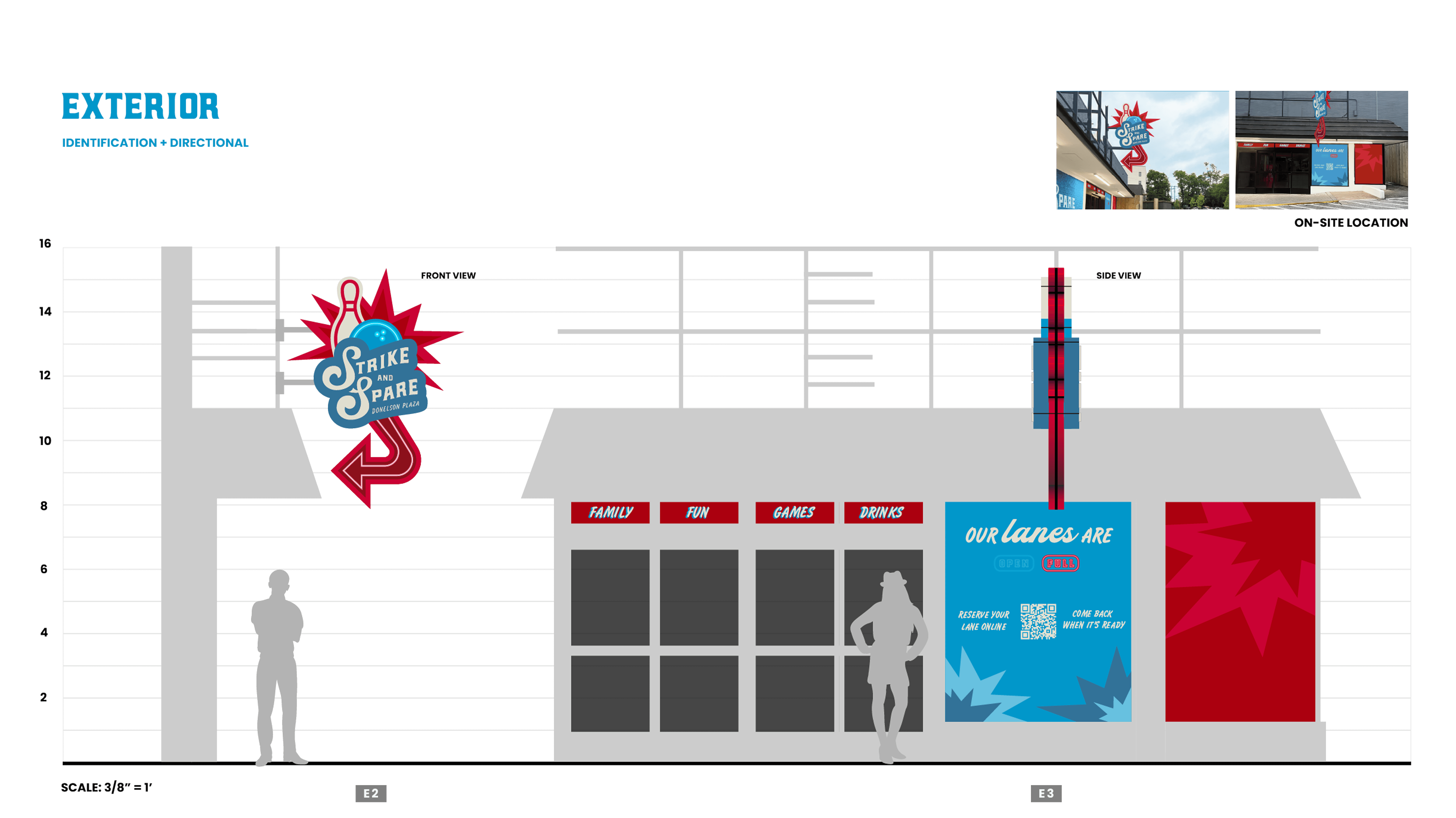
The final signage rollout brings the Strike & Spare rebrand into the physical space. Each sign was designed to balance bold visual impact with practical readability, working across both bright ambient lighting and the low-light conditions of cosmic bowling nights.
Materials, scale, and mounting were considered for each sign type. From large-format lane identifiers to directional wayfinding markers, every piece was designed as part of a cohesive system rather than a collection of individual assets.
*no AI was used for the rendering for these mockups
The final signage rollout brings the Strike & Spare rebrand into the physical space. Each sign was designed to balance bold visual impact with practical readability, working across both bright ambient lighting and the low-light conditions of cosmic bowling nights.
Materials, scale, and mounting were considered for each sign type. From large-format lane identifiers to directional wayfinding markers, every piece was designed as part of a cohesive system rather than a collection of individual assets.
*no AI was used for the rendering for these mockups
The final signage rollout brings the Strike & Spare rebrand into the physical space. Each sign was designed to balance bold visual impact with practical readability, working across both bright ambient lighting and the low-light conditions of cosmic bowling nights.
Materials, scale, and mounting were considered for each sign type. From large-format lane identifiers to directional wayfinding markers, every piece was designed as part of a cohesive system rather than a collection of individual assets.
*no AI was used for the rendering for these mockups


Physical Signage Prototype
Physical Signage Prototype
Physical Signage Prototype
A physical prototype was built to validate the system drawings before final production. Testing the signage at scale in a real-world context revealed how materials, proportions, and contrast held up under actual venue lighting conditions, allowing for refinements that could only be caught through physical testing rather than on-screen review.
A physical prototype was built to validate the system drawings before final production. Testing the signage at scale in a real-world context revealed how materials, proportions, and contrast held up under actual venue lighting conditions, allowing for refinements that could only be caught through physical testing rather than on-screen review.
A physical prototype was built to validate the system drawings before final production. Testing the signage at scale in a real-world context revealed how materials, proportions, and contrast held up under actual venue lighting conditions, allowing for refinements that could only be caught through physical testing rather than on-screen review.

Design
Design
Design
Digital Design
Digital Design
Digital Design
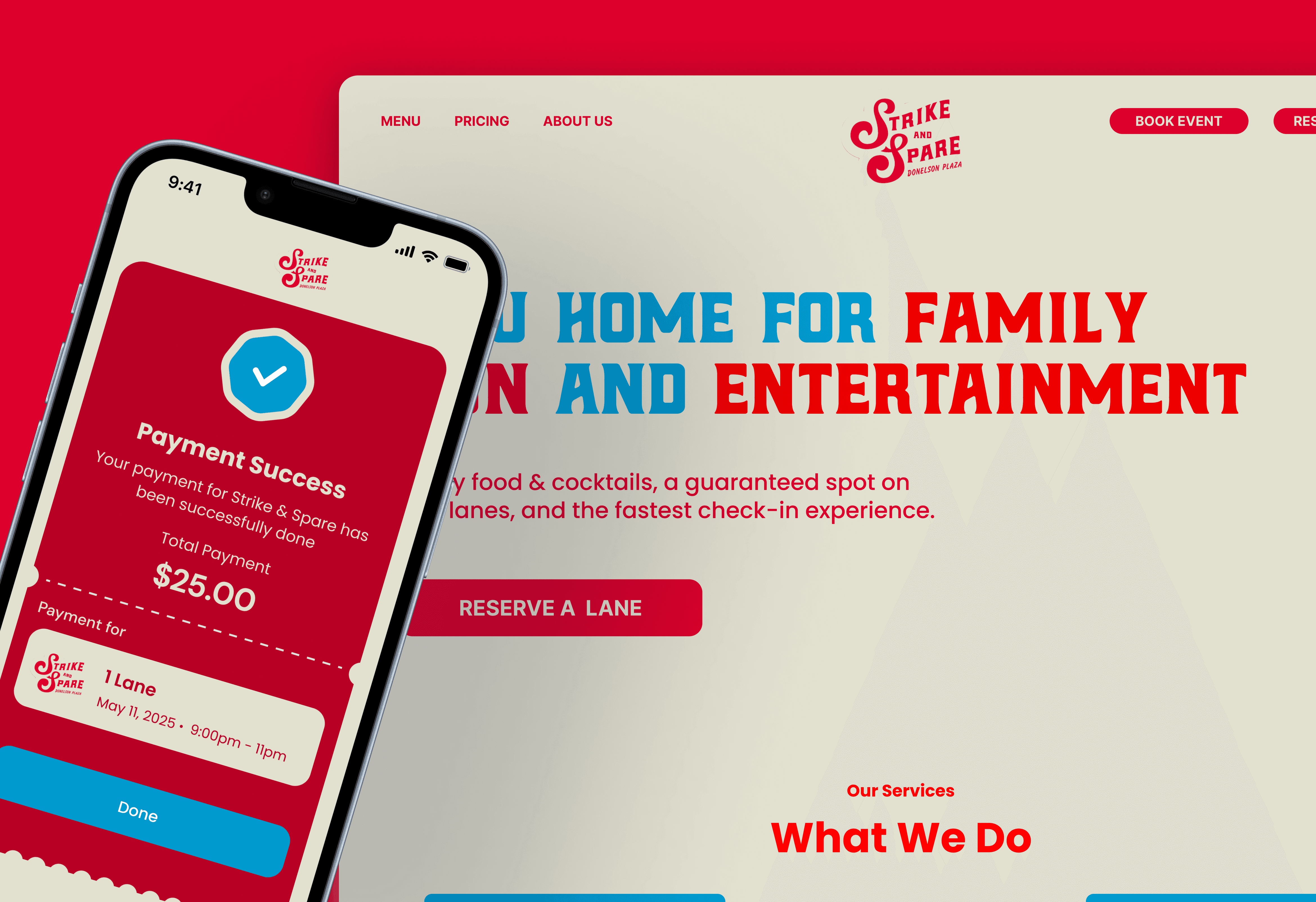
The digital experience extends the rebrand beyond the physical space. The Strike & Spare app was redesigned to reflect the new visual identity, giving customers a consistent brand experience from the moment they book online to the moment they leave the lanes.
Key flows designed include lane booking, payment confirmation, and event discovery. The UI prioritises speed and simplicity, most customers are booking on the go, and the design reflects that by minimising steps and surfacing the most important actions upfront.
The digital experience extends the rebrand beyond the physical space. The Strike & Spare app was redesigned to reflect the new visual identity, giving customers a consistent brand experience from the moment they book online to the moment they leave the lanes.
Key flows designed include lane booking, payment confirmation, and event discovery. The UI prioritises speed and simplicity, most customers are booking on the go, and the design reflects that by minimising steps and surfacing the most important actions upfront.
The digital experience extends the rebrand beyond the physical space. The Strike & Spare app was redesigned to reflect the new visual identity, giving customers a consistent brand experience from the moment they book online to the moment they leave the lanes.
Key flows designed include lane booking, payment confirmation, and event discovery. The UI prioritises speed and simplicity, most customers are booking on the go, and the design reflects that by minimising steps and surfacing the most important actions upfront.

Your payment for Strike & Spare has been successfully done
Your payment for Strike & Spare has been successfully done
Your payment for Strike & Spare has been successfully done
Payment Success
Payment Success
Payment Success
Total Payment
Total Payment
Total Payment
$25.00
$25.00
$25.00
1 Lane
1 Lane
1 Lane
May 11, 2025
May 11, 2025
May 11, 2025
9:00pm - 11pm
9:00pm - 11pm
9:00pm - 11pm
Payment for
Payment for
Payment for

Done
Done
Done
Your payment for Strike & Spare has been successfully done
Your payment for Strike & Spare has been successfully done
Your payment for Strike & Spare has been successfully done
Payment Success
Payment Success
Payment Success
Total Payment
Total Payment
Total Payment
$25.00
$25.00
$25.00
1 Lane
1 Lane
1 Lane
May 11, 2025
May 11, 2025
May 11, 2025
9:00pm - 11pm
9:00pm - 11pm
9:00pm - 11pm
Payment for
Payment for
Payment for
Done
Done
Done
Wrapping Up
Wrapping Up
Wrapping Up
Reflection
Reflection
Reflection
Designing for a real, physical space taught me that UX extends far beyond screens. Every decision, from the weight of a font on a sign to the height at which it's mounted, has a direct impact on how real people move through and experience a space. The site visit wasn't just a research step, it was the foundation that made every design decision grounded and defensible.
Designing for a real, physical space taught me that UX extends far beyond screens. Every decision, from the weight of a font on a sign to the height at which it's mounted, has a direct impact on how real people move through and experience a space. The site visit wasn't just a research step, it was the foundation that made every design decision grounded and defensible.
Designing for a real, physical space taught me that UX extends far beyond screens. Every decision, from the weight of a font on a sign to the height at which it's mounted, has a direct impact on how real people move through and experience a space. The site visit wasn't just a research step, it was the foundation that made every design decision grounded and defensible.
Love this project as much as I do?
Love this project as much as I do?


Shivali Meenakshi Murali © 2026
Shivali Meenakshi Murali © 2026
Shivali MM © 2025